Here's the reality: if your website doesn't work perfectly on a phone, you're losing jobs. Not theoretical future jobs. Jobs today.
According to Google's latest data, 73% of local searches happen on mobile devices. For service businesses like plumbers, electricians, roofers, and HVAC contractors, that number is even higher. When someone's water heater breaks at 9 PM, they're not pulling out a laptop. They're Googling "emergency plumber near me" on their phone.
If your site loads slowly, looks broken, or requires zooming and pinching to read, they're hitting the back button and calling your competitor.
What "Mobile-Friendly" Actually Means
A mobile-friendly website isn't just a desktop site shrunk down. It's a site designed to work on a 6-inch screen first, then scaled up to larger screens.
Here's what that looks like in practice:
- Readable text without zooming. Font sizes should be at least 16px. No tiny print.
- Tap targets big enough for thumbs. Buttons and links need space. If your "Call Now" button is 10 pixels wide, no one's tapping it on the first try.
- Fast load times. Mobile users are on slower connections. If your site takes 8 seconds to load because you've got 15 uncompressed photos, they're gone.
- No horizontal scrolling. Everything should fit the width of the screen. Horizontal scrolling is a sign of a broken layout.
- Click-to-call buttons. On mobile, your phone number should be a tappable link that opens the dialer. Make it easy.
Google's Mobile-First Indexing
Since 2019, Google has used mobile-first indexing for all websites. That means Google's ranking algorithm looks at the mobile version of your site first, not the desktop version.
If your mobile site is slow, missing content, or hard to navigate, your SEO rankings suffer. Google doesn't care how good your desktop site looks if 70% of users never see it.
Test your site on mobile right now. Pull out your phone, Google your business, and click through to your site. Can you read it? Can you find your phone number? Can you navigate to your services? If the answer is no, you have work to do.
The Conversion Gap
Mobile traffic doesn't just outnumber desktop traffic. Mobile users convert differently.
For local service businesses, mobile users are often searching with immediate intent. They need a plumber now. They need their AC fixed today. They're not browsing — they're ready to call.
That means your mobile site needs to prioritize:
- Your phone number (visible, clickable, above the fold)
- Your service area (so they know you cover their location)
- Proof you're legit (reviews, years in business, certifications)
- A simple form (if they can't call right now, make it easy to request a callback)
Desktop users might spend 5 minutes reading your About page and browsing your blog. Mobile users want to know: Can you help me? Are you nearby? Can I call you right now?
Common Mobile Website Mistakes
We see these mistakes constantly when auditing local service business websites:
- Tiny text. If your font is 12px, no one over 40 can read it without glasses and a magnifying glass.
- Pop-ups that cover the whole screen. Google penalizes intrusive interstitials on mobile. If your pop-up blocks the content and there's no easy way to close it, you're hurting your rankings.
- Unoptimized images. A 4MB photo might look great on desktop, but it kills mobile load times.
- Navigation buried in a broken menu. If your hamburger menu doesn't work or requires 3 taps to get to your services page, users will leave.
- Forms with tiny input fields. If your contact form is hard to fill out on mobile, you're losing leads.
Responsive Design vs. Mobile-Specific Sites
You might have heard of businesses maintaining separate mobile sites (usually on an m.yoursite.com subdomain). Don't do this.
Responsive design — where one site adapts to different screen sizes — is the modern standard. It's easier to maintain, better for SEO, and provides a consistent experience across devices.
A responsive website uses flexible layouts and CSS media queries to adjust the design based on screen size. The same content, same URL, just optimized for the device viewing it.
Page Speed Matters More on Mobile
Google's Core Web Vitals — the metrics that measure page speed and user experience — are weighted heavily on mobile.
Key metrics to watch:
- Largest Contentful Paint (LCP): How long it takes for the main content to load. Should be under 2.5 seconds.
- First Input Delay (FID): How quickly the page responds to user interaction. Should be under 100ms.
- Cumulative Layout Shift (CLS): How much the page jumps around while loading. Should be under 0.1.
If your mobile site is slow, users bounce. Google sees that bounce rate and drops your rankings. It's a vicious cycle.
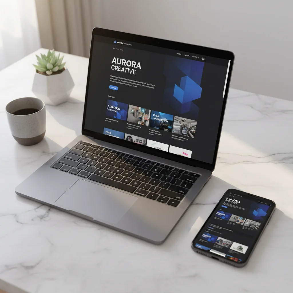
What BizWebFix Does for Mobile
Every landing page we build is mobile-first by default. That means:
- Responsive design that works on every screen size
- Optimized images that load fast on mobile connections
- Click-to-call buttons prominently placed
- Fast load times (under 2 seconds on mobile)
- No intrusive pop-ups or broken menus
We test every page on real devices before it goes live. Because if it doesn't work on mobile, it doesn't work.
Get a Mobile-First Landing Page
$300 one-time. Responsive design included. Free hosting forever.
Start Free Trial →